
US County-level maps
Despite having the largest number of confirmed Covid-19 cases in the world, some of the US is still green.
Adopting travel restrictions, and having quarantines upon arrival, would allow the green zones to stay green while the red zones recover.
Please Note that current case reporting might lead to underestimation of real case numbers in your region if there are many unregistered tests or if testing is limited. given the same level of test reporting for positive tests, yellow and red areas should still provide information on falling and increasing numbers, respectively.
COVID TRENDS
Created by: Olha Buchel from the New England Complex Systems Institute and Joseph D. Ortiz from Kent State University, Department of Geology.
The map and classification code are available at https://github.com/obuchel/classification.
For divisional county-level green-zone rankings see here.
Back to the topCOVID 14 day cases
Back to the top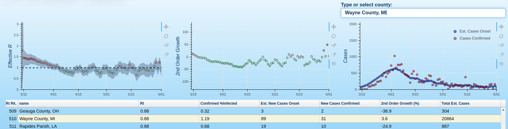
For more in-depth data exploration of county-level trends on the desktop, see these dashboards.